
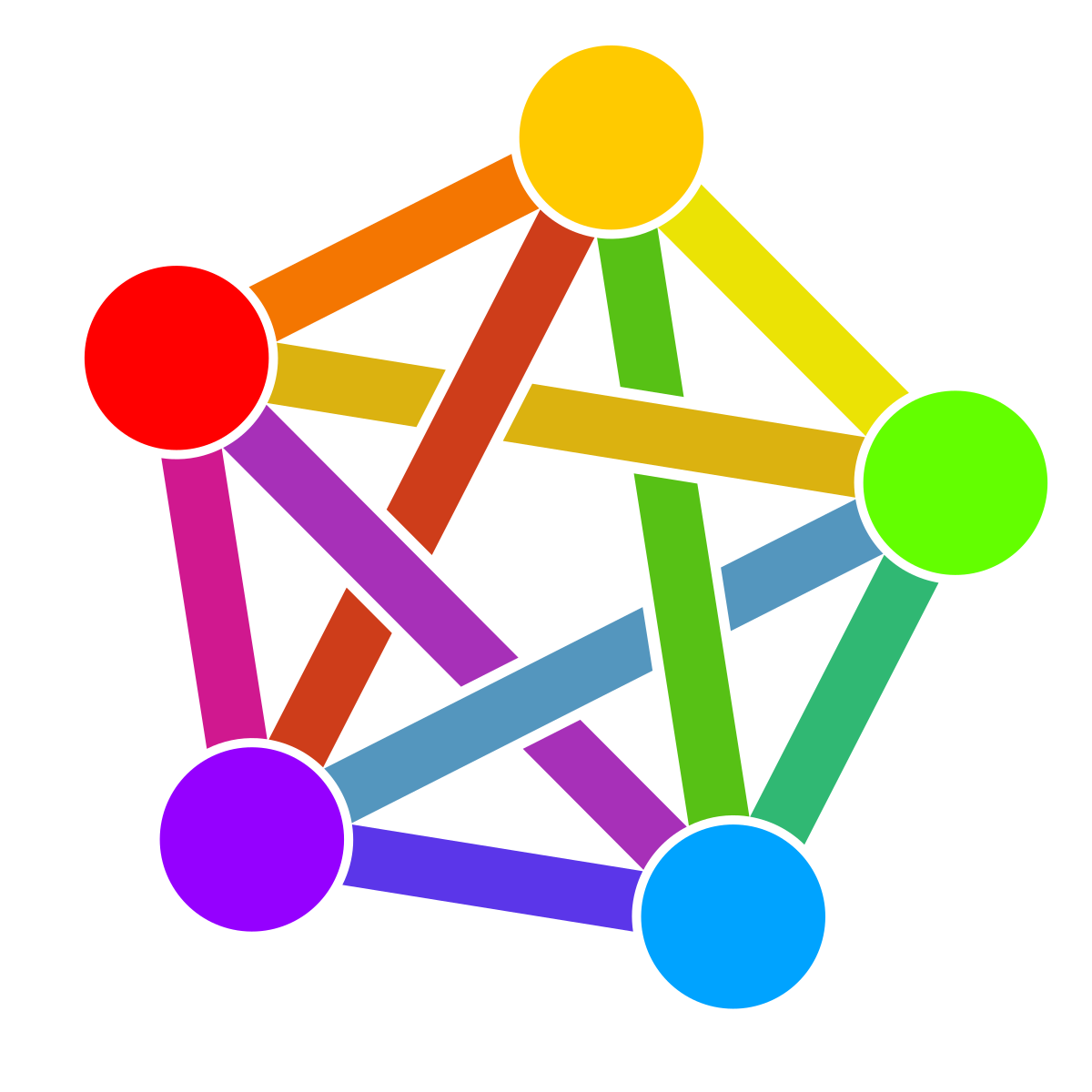

idk it’s my first time (kind of) trying to do dataviz, I thought the original post was super interesting but like other comments said, it was hard to read.
I think in a way it’s mostly because defederation is complex to show as links, since it is the break of said link, but hopefully this type of graph is better ?
you do lose the “group” of instances view, though (and also I did not bother with per instance MAU as raw number + percentage, or sofware used)
let me know what you think!
This graph is a lot more understandable, but the yellow is hard to see. I can’t tell what instance lemmy.ml is defederating.
I assume for you it may be because of your display type. But that made me think of colorblind people and how much this format probably totally excludes them as an entire swath of the population
I’m colorblind. It does :/
Do you have any design suggestions for op? (Assuming they’re the originators of this chart)
Because as it is, this data is pretty hard to concisely portray. Whoever made this decided to use color, alone, which, even for me who is not colorblind, thinks could use some improvement. Design IS hard, the question is how.
In this particular instance, I don’t have many suggestions other than, maybe change the saturation?
To give an example, the rainbow pride flag has always looked muddy to me;
But I recently saw a colorblind friendly version that, to my eyes anyway, looks really good. I can much more easily distinguish the stripes in this one:
I don’t know the exact mechanics of how these are different. But maybe there’s a lesson here about colorblind friendly stats representation?
The second flag’s colors look extremely well balanced in both brightness and color variance between them. That’s weirdly satisfying to look at.
But yeah, just having higher contrast in the chart would be a good start. Maybe some kind of three dimensionality with graded shadows? Or like have them as lines, and have them not have such similar angles? But then I expect that to be messy and not quick to read, either.
You’ve managed to nerd snipe me with the colourblind friendly Pride flag, the second one somehow looks really good!
Chiming in as the OP, I used rawgraphs.io which only has 2 colour palettes for this amount of data (the first one only covers 7 colors the rest becomes grey), there’s the option to pick your own colours and I considered picking colours from instances logos so they would fit. No idea if that would have been better for accessibility. In general there are colourblind-friendly colour palettes suggestions out there and I should have checked them first!
The porn one.
fedinsfw.app looks like.