

You must log in or # to comment.
Given all the comments missing the point (also written in the title), I appreciate that yours would pass the message better
Is it just me or do those pink versions of Russia include Crimea?
No, as far as I can see, they don’t, the western border of russia is straight-ish without Crimea protruding further to the west.
However, in the base map (upper image), Crimea seems to be neither Ukraine nor russia.
Do we really need all this Mercator ragebait? Just look at a fucking globe - it’s the thing your dad keeps the scotch in.
(alternatively most map apps go to a globe view when you zoom right out.)
(alternatively most map apps go to a globe view when you zoom right out.)
Well, … no, at least GMaps, OSMAnd, Comaps don’t. Thanks to @shadowtofu@discuss.tchncs.de for the hint. https://discuss.tchncs.de/comment/23729118
what? google maps absolutely has a globe view when you zoom out
Mine doesn’t. Neither map view nor satellite view.

(and wait until you see the number the Tube Map did on south London.)
i mean, i’d say the lack of tube lines is the bigger issue
Not even a mention of africa
Why does Africa, the largest continent, not simply eat the other ones?

Silly Mercator projection
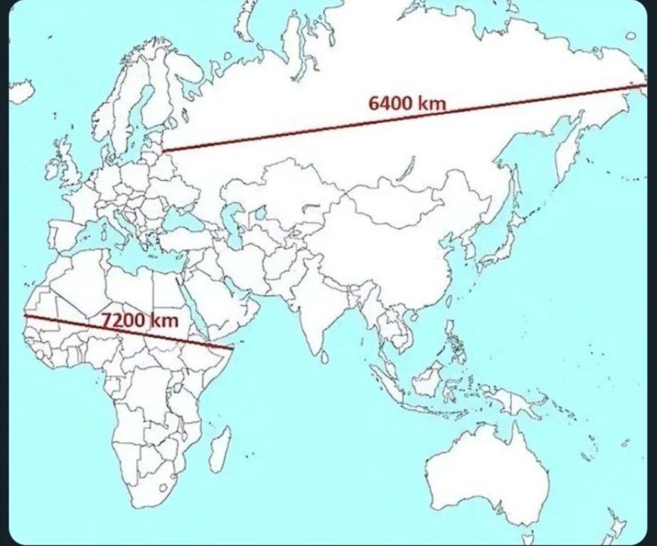
No, one kilometer in Africa is about 60 % shorter than in russia.
This. It’s closer to the equator, so they are rotating faster which means the kilometers get shorter. Don’t you just love science?
~Its gonna take a lot to drag me away from you~
Still best for sailing the high seas.
You think I just go after software? /s
I wish we would stop stretching land masses and start stretching oceans in basic maps. We don’t need the Mercator for naval navigation in our day to day lives, but knowing the real size of Russia and Africa would affect our basic view of the world.
Here you go:

Perfection.
In which Asia’s and Africa’s claim to “continent” status looks suddenly shaky, and Europe’s completely laughable.
except that continents quite plainly aren’t just about landmasses, they’re defined by culture as well. Hence why most people these days consider “oceania” a continent, and why india and the middle east don’t really fit smoothly into any standard continent.
There seems to be a better name for what you are talking about. Fair point about Oceania though, that’s as uncontinental as Europe.
If Africa was the same continent as Asia, it should be easy to walk across.
But you literally can’t. The only connections are a freeway bridge (currently closed), a railway bridge, a road tunnel and ferries. And geologically, an ocean is in the process of opening up in between.As for Europe, it doesn’t even have its own continental plate.
It’s less of a continent than India.India is only not often counted as a continent because it decided to bum rush Asia, creating work for generations of sherpas dragging half-dead white men up excitingly tall mountains in the process.
If Africa was the same continent as Asia, it should be easy to walk across.
They literally had to dig the Suez channel to separate both.
geologically, an ocean is in the process of opening up in between
Hardly. Africa is converging with Europe and the Med is being crushed. It’s only moving away from Arabia.
Maybe the oceanbuilding process between Africa and Asia stopped after I finished my MSc in Geoscience 10 years ago, but I doubt it.
It’s only moving away from Arabia.
Never said it would move away from anything else.
stopped after I finished my MSc in Geoscience
This snarky argument from authority is redundant given that the facts are extremely easy to understand and outlined in the Wikipedia article I cited.
The biggest gap between Africa and Eurasia (PS; we agree that Europe is not a continent) is the Mediterranean sea, and it is getting smaller. That does seem relevant.
The Red Sea is what’s becoming an ocean, technically speaking.
If stretching is ok, then why not go all the way.
If you dislike stretching, you can always cut instead. That’s why we also have a series of octahedral butterfly maps.
If that’s not polyhedral enough, you could try the Dymaxion projection instead.
i honestly really like dymaxion because it’s a nice aspect ratio and keeping the landmasses all together just feels right.
And it doesn’t even look strange if you just remove the ocean
S-tier cartography right there.
That butterfly one looks sick, I’m not a fan of the overplayed “world map in a cool material” wall-art but this one might get a pass depending on the execution.
There are several projections that follow this butterfly style. Still haven’t decided which one I want on my wall. There’s a local laser cutting company that definitely could make one out of plywood. I think it would look awesome.
Actually, azimuthal equidistant is unironically useful if it centers on you.
Absolutely. In a sailing context, it would totally make sense to have a digital map like that. I don’t know if professional navigators actually do that though. Maybe they have some even more obscure projection that has some unique benefits that fit a particular niche.
Specifically, radio operators like them - with a directional antenna, it matters which direction goes from Canada to Australia the fastest, and if your station is fixed it can even be a paper map.
I don’t know what sailing yachts would use. Probably a close-up map that’s nearly flat anyway, since surf, wind direction and local obstacles are the main consideration. In commercial or military sailing, it’s entirely possible normal navigation just takes place automatically and digitally at this point. Sextant, compass and Mercator still exist as a backup, though!
In a military context, you absolutely need to have robust backups. If your ship gets badly damaged you better be familiar with star charts and sextants.
Oh, and that radio operator thing makes a lot of sense too.
Thanks, I hate you.
I really wish discussions of map projections would move beyond “wow look how badly mercator represents size”
This kind of post comes up like every week.
Behold the perfect map:
- all areas have correct relative size
- rectangular map shape
- rectangular coordinates
- zero distortion along equator
- centered on date line, not some irrelevant Bri’ish town
- aspect ratio (width/height) is π
- developed by a mathematician
Show map

(Bonus: England is cut in half)The Russian “11 time zones” fallacy. At the north pole you can get 24 time zones into one square meter.
Okay, now this is getting ridiculous. You put this same thing on a typical equal-area projection and it will still fail.
Projections distorting things isn’t a conspiracy, it’s guaranteed by mathematics.
That’s why I always carry around my pocket globe and compass to scale and compare distances accurately.
Shouldn’t it say ‘this is the true size of Russian’? Africa is close to proportional, Russia is the half of the example stretched out.
I’m not sure I’ve ever seen a Mercator map except in internet content complaining about them
Have you used Google Maps? Or OpenStreetMap?
Huh.
Well I’ll be damned! I actually thought Google zoomed out to a globe but that’s only on the satellite layer.
At least those tools actually are for navigation, not for showing the entire world.
That seems like one of those education things.


