
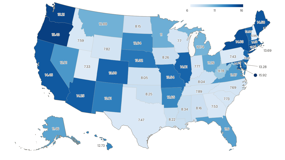
So it looks like your bang doesn’t go tooo far for your buck even if you live in a LCOL state when you are on minimum wage I guess
Is this useful? What do you think? I honestly don’t know, but seen that I already had the data from this discussion, why not plot it?
I tried to find a map with it, but my searching skills seem to have deteriorated (or search engines aren’t great nowadays)
Data taken from St. Louis Fed’s FRED (Federal Reserve Economic Data) for “Regional Price Parities (RPP): All Items” and “State Minimum Wage Rate”
Latest data available for RPP is 2024, so I used same date for wages. For states with no minimum-wage law or a minimum wage below the federal minimum wage, federal minimum wage was applied like the folks at Economic Policy Institute do
Convertion based on following formula:
real wage = nominal wage * (100 / RPP)
Plotted with ultimaps.com, if anyone has another alternative that shows data + state abbreviation, lmk
What flaws do you see on this map? Where does it fail? I guess metro areas are always complicated and a more granular approach with county data would be more useful, right?
This is a cool map! One thing I would highlight is that the “All Items” RPP is expenditure-weighted, not a simple average of Goods, Rents, and Other Services (the 3 categories FRED lists). The weights are supposed to reflect how much consumers actually spend in those categories – so this could also be considered a very rough quality-of-life map too. That said, I couldn’t find what the FRED “all items” calculation was using for these weighted component values. The best I could find was one example from the Bureau of Economic Analysis that shows how the value is arrived at.