

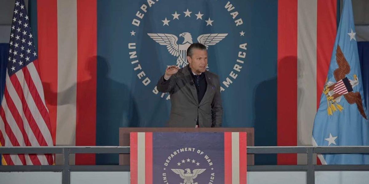
An angular eagle behind the defense secretary departed from the Pentagon’s established branding. Critics saw echoes of the Third Reich.
A reimagined “Department of War” logo displayed behind Defense Secretary Pete Hegseth at a recent speech drew immediate comparisons to Third Reich iconography.
Speaking to Air Force Academy cadets on Saturday, Hegseth stood in front of a monochrome logo for his agency that differs from the designs in the Defense Department’s official branding guide. The backdrop features a stylized eagle that critics compared to the straight-edged Reichsadler used by Nazi Germany under Adolf Hitler.
If I had a hindu swastika outside a temple and wanted “do a modern redesign” I’d definitely avoid rotating it by 45 degrees, removing the inner circles, and choosing a red, black, and white color pallet.
If I happen to do that by mistake. I’d definitely absolutely understand when someone pointed out that my “modern design” just suspiciously made it look MORE like a Nazi symbol. Which would clearly be the opposite intention behind a symbol that already has a similar look.
Point being. If we have imagery or symbols from the past that are similar to a white supremacist genocidal state and we were doing a “redesign” there is no possible way a well intention person could accidentally make it “more Nazi looking”.
It’s on purpose. It’s not gonna help your fox news parents. True. But anyone with a brain can understand what is being done here.